Monitoring application groups traffic
The Traffic Analysis Applications Groups report shows the top application groups by data volume for a selected time period. Inbound and outbound traffic are shown separately.
This report answers questions such as:
- Which application groups may be overrunning my network?
- Is the proportion of traffic for a particular application group what I expect?
Use this information to determine if you need to create policies to control or protect high data volume application groups.
You can drill into the application group by clicking on the application group name in the tables below the charts. This shows the Hosts Report which lists hosts in the selected application group. You can then drill into a particular application to see the hosts using that application.
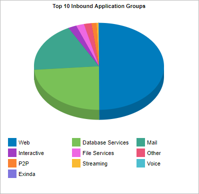
The Applications Group report displays the top 10 inbound application groups.
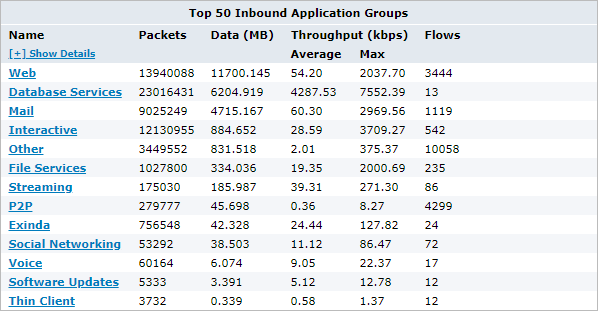
The tables at the bottom of the report show for each of the top application groups, the total amount of data, and the maximum and average throughput rates, the number of packets, and the number of flows for the selected time period. More network metrics, such as, round-trip time (RTT), network and server delays, and TCPTransmission Control Protocol efficiency can be shown by clicking on the Show Details link in the tables.
The Application Groups report displays traffic volume from the top application groups.
To access this report:
- On your browser, open the Exinda Web UI (
https://Exinda_IPInternet protocol_address). - Key-in the User and Password.
- Click Login.
- Go to Monitor > Applications > Application Groups.
Monitoring reports can be exported as a PDF document, saved as a scheduled report, or can be printed directly from the Web UI. For more information refer to Exporting, printing and scheduling reports.
You can customize the applications objects included in an application group. For more information refer to Adding and updating application group objects .
To interact with the pie-based reports, you can hover over the pie slices to view the amount of data transferred as well as view the percentage of the pie. Note that the pie is showing only the top items, so the proportion is relative to the top items - not relative to all the traffic through the appliance. That is, if one wedge showed 50% of the traffic, that means it is 50% of the top items, not 50% through the appliance.
- To understand how to set the desired time range for a chart, see Setting the Time Range.
- To understand how to drill into the data to find particular filtered data, see Drilling into the Data.
- To understand how to print the report or schedule the report, see Printing and Scheduling Reports.