Understanding the relationships between charts and data
On the new time series monitoring screens, there will be a pie chart and a bar chart showing the top data by volume for the specified time period and a time chart showing the same top times. There will be one set of these charts for inbound traffic and one for outbound traffic. In some instances, another chart that shows the top three items of another application type for each of the top data elements. For example, if looking at the virtual circuits chart, you will see the top virtual circuits as a bar chart. Then beside the bar chart, there will be a stacked horizontal bar chart which shows the top three applications for each of the top virtual circuits.
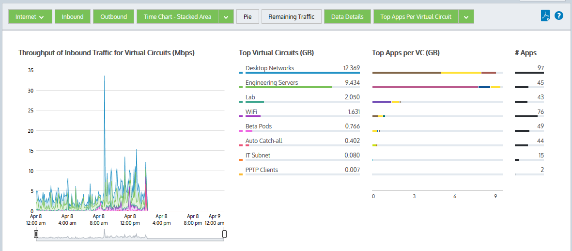
Vritual circuit details
When you brush over an item in any of these charts, the item is highlighted in all the charts.
There are toggle buttons at the top of the chart which you can use to turn on and off different chart elements.
- Inbound button – Toggles on or off all reporting for inbound traffic including all the charts and the data tables below the charts.
- Outbound button – Toggles on or off all reporting for outbound traffic including all the charts and the data table below the charts.
- Stacked Chart or Line Chart button – Toggles on or off the time series charts or selects a different view of the data. Press the down arrow next to the Stacked Chart button to select Line Chart to switch to the line chart. Conversely, press the down arrow next to the Line Chart button to select Stacked Chart and switch to the stacked area chart. The line chart shows the virtual circuits against the common zero baselineused by monitors and performance reports to establish a standard by which sunsequent performance can be measured so that the throughput of the virtual circuits can be compared with one another and the pattern of a specific virtual circuitlogical definitions that partition a a physical network circuit and used to determine what traffic passes through it and how much is clearer. You can look for particular patterns such as spikes or flat tops.
- Pie button – Toggles on or off the data volume pie charts.
- Remaining Traffic button – Toggles on or off the rest of the data that is not represented in the top virtual circuits. When toggled on, a gray chart series will appear in all charts (throughput, pie, top virtual circuits) representing all the virtual circuits in your network that are not explicitly represented in the top virtual circuits. If the remaining virtual circuits show vastly more data volume than the top virtual circuits, then the top virtual circuits may look insignificant relative to the total, and so you may need to toggle off the remaining traffic category to see the relative differences and usage patterns of the top virtual circuits.
- Data Details button – Toggles on or off the tables of data below the charts.
- Top Apps Per X(bar chart row) button –Toggles on or off extra charts showing the top 3 apps for each row in the bar chart and the number of apps for each row in the bar chart.