Monitoring application performance scores
The Application Performance Score (APSApplication Perfromance Score) report shows scores that assess network performance and user experience when using business-critical applications.
These charts can answer questions such as:
- Are my important applications performing well from a network perspective for my network users?
- Has this been a persistent problem or is it getting worse?
- If an application is not performing well, what might be causing the problem?
To access the report:
- On your browser, open the Exinda Web UI (
https://Exinda_IPInternet protocol_address). - Key-in the User and Password.
- Click Login.
- Go to Monitor > Service Levels > Application Performance Score (APS).
Monitoring reports can be exported as a PDF document, saved as a scheduled report, or can be printed directly from the Web UI. For more information refer to Exporting, printing and scheduling reports.
A score between 0 and 10, where 0 is poor and 10 is excellent, indicates whether the app is performing well or poorly.
Scores are graphed over time to show how the scores changes and trends. The underlying metrics and measures used to calculate scores are shown in the table below the graph. You can drill into the details of the APS by clicking an application name.
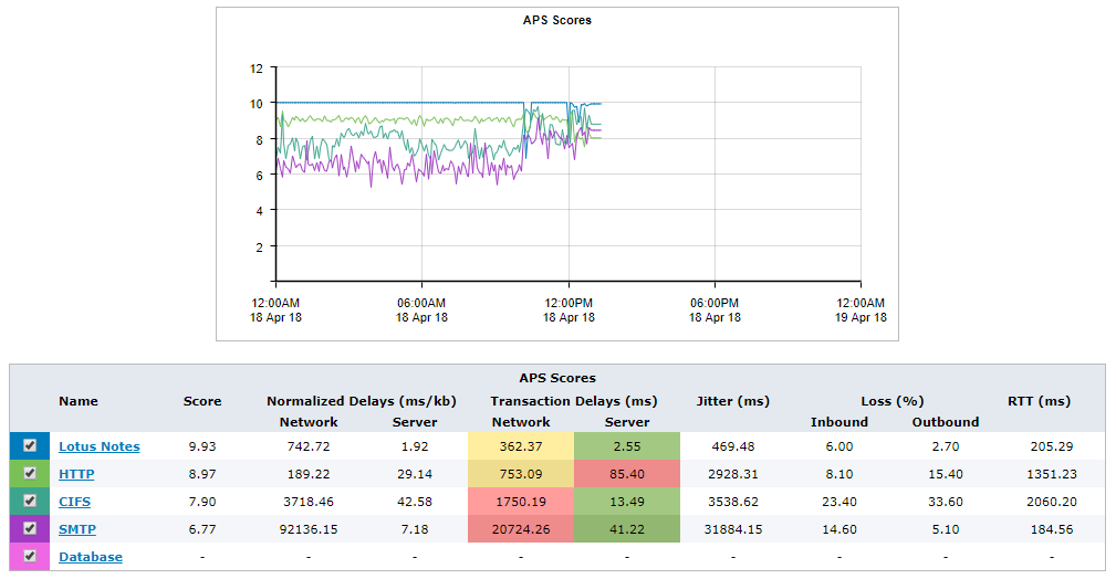
The Application Performance Score displays scores from 0 - 10 over time.
A score includes input from one or more of the following metrics:
- Network delay – the time taken for data to traverse the network (on the wire)
- Server delay – the time taken for a server to respond to the request
- Normalized network delay – the time taken for data to traverse the network, where the delay is measured independent of the transaction size by assuming a normalized packet size of 1024 bytes
- Normalized server delay – the time taken for a server to respond to the request, where the delay is measured independently of the transaction size, by assuming a normalized packet size of 1024 bytes
- Round-trip time – the time taken for
- Jitter – the measure of variability of network delay, defined as one standard deviation of network delay
- Inbound loss – the percentage of packet loss on inbound traffic
- Outbound loss – the percentage of packet loss on outbound traffic
Each metric that contributes to the score has a threshold value set. The threshold may have been set manually or may have been determined automatically by the Exinda Appliance observing the traffic for the period of time to determine a baselineused by monitors and performance reports to establish a standard by which sunsequent performance can be measured threshold values. The table below the chart indicates the current observed values for these metrics and whether that value is considered good or not.
- If the observed traffic is within the threshold, it is considered good and is colored green in the APS Scores table.
- If the observed traffic is above the threshold but not above 4 x the threshold, it is considered tolerable and is colored yellow.
- If the observed traffic is above 4 x the threshold, it is considered poor and is colored red.
- If there is no color in the table for a particular metric, it indicates that the metric is not contributing to the calculation of the APS score.
Use this information to determine which metrics contribute to an application's performance score.
Generate a PDF report of APS results
Create a report that contains the APS, TCPTransmission Control Protocol health, and TCP efficiency for a specified period of time.
- On your browser, open the Exinda Web UI (
https://Exinda_IP_address). - Key-in the User and Password.
- Click Login.
- Click Report and switch to the PDF Reports tab.
- Click Add New PDF Report.
- In the Report Selection area select APS, TCP Health, and TCP Efficiency.
- In the Report Details area, type a name for the report.
- Specify how often the report will be generated.
- Click Add New Report.
- To generate the report, locate the report in the list and click PDF.
What to expect
If an APS report is not showing data
Either the APS object does not have thresholds set and therefore the score cannot be calculated or there is no traffic for the specified application on the network for the period that is shown on the screen.
If the thresholds were set by using the baselining feature
You should get an application performance score of 9.0 if the same traffic were to be observed.
Evaluating the APS
If the thresholds were set by using the baselining feature, a score of 8.5 or higher is considered a good score. The thresholds are automatically set to be slightly higher than the average observed measures so that good would be at the top end of the range of scores.
If you set the thresholds manually such that your thresholds lie at the boundary of what you consider good or not good, then you should consider APS scores greater than 5.0 good, as statistically half the time you would expect the observed values to be slightly above your threshold and half the time the observed values would be slightly below the threshold.
Looking at the results
Determining what might be causing a low APS score
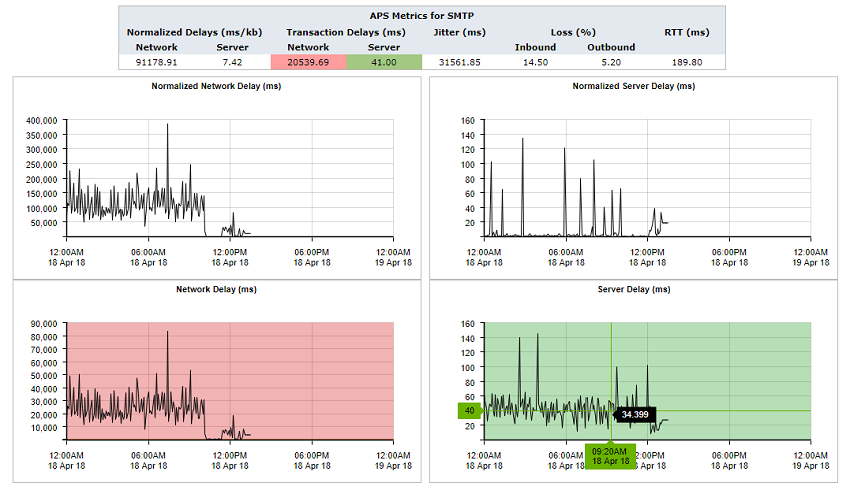
Click the APS name in the table. A new screen that shows charts for each underlying metric appears. The background of each chart is colored to represent value within threshold, within 4 x threshold, and above.
If the background of the chart is not colored, that metric does not contribute to the calculation of the APS score. You can zoom into these charts by clicking and dragging within a chart to zoom into the x-axis range. All other charts will synchronize their zoom ranges to the specified zoom range.
The metrics showing poor values could indicate a problem to investigate. For example, if the network delay is good, but the server delay is poor, you know that the network is not to blame and that the server administrator should take a look at the application server.
Determining if a problem has been persistent
Look at the APS score time line. If the score has been low for an extended period or if it looks like the score is dropping, you’ll know that this is a persistent problem that needs addressing.
Determining if you should pay attention to the normalized delays or the transaction delays
Generally, you should use the transaction delays unless the protocol that is being monitored has large or variable sized packets. The normalized delay measure normalizes the score to reflect a 1024 packet size allowing you to more easily compare delays when the packets are variable in size.
Configuring the system to notify you if the APS score drops too low
You can configure the system to send an email if the APS score drops below an APS value you specify and remains below that value for a specified duration. For example, you can set it to notify you if it drops below 7.0 and stays below 7.0 for 5 minutes.
Making the APS chart easier to read by removing score lines
- You can temporarily remove lines from the APS Scores chart by clearing the checkboxes next to the APS name in the table.
- You can zoom into an area of interest by clicking and dragging in the chart to select a smaller time range. This often has the effect of flattening the lines so that it appears less cluttered.