Benefits Dashboard
The Benefits Dashboard exposes a set of widgets arranged on a dashboard that shows high level information about your network traffic. The dashboard answers questions, such as "What are the dominant application groups on my network? Are recreational apps using a large amount of my bandwidth? Is my link saturated? Am I getting the reductionmeasures the amount of redundant data that has been removed from the network, increasing capacity that I'm expecting?" The dashboard may also show a recommendation. The Exinda Appliance analyzes network traffic and makes recommendations based on what it learns.
Widgets can be hidden to customize the dashboard to only include widget(s) relevant to you. To add a hidden widget, click the 'Add More' link at the top right of the dashboard. If the 'Add More' link is not visible, then all available widgets are displayed. Widget settings and layouts are retained between log-ins.
The dashboard can be captured and converted to PDF by clicking on the PDF icon at the top-right of the interface.
Exinda recommends
Every night after midnight, your Exinda Appliance analyzes the traffic it saw during the previous day and, if there was something remarkable or unusual, it makes a recommendation, displays it on the dashboard and sends it to the email addresses configured in Network Setup > Email.
Each recommendation includes the date of the traffic data. Dismiss the recommendation by clicking the close button. To view the last three recommendations made, double-click the Exinda logo in the header bar on the dashboard.
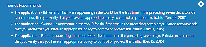
Example of Exinda recommendation messages in the dashboard
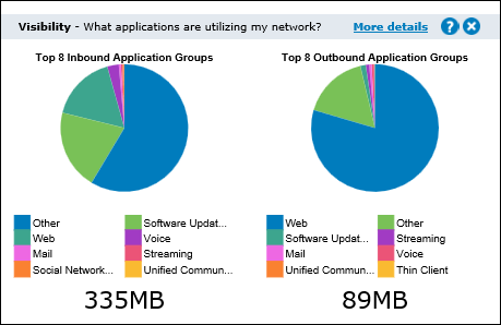
Visibility
Visibility gives you insight into the traffic on your network so you can effectively control or protect it. The visibility graphs show application groups utilizing the network. These graphs answer questions such as, "Are streaming applications for music and videos choking the network? Are data backups overrunning the network?"
Click the drill down link to see which apps are in an application group.
Reduction
Reduction measures the amount of redundant data removed from the network, increasing free capacity. Data previously seen by the system is "remembered" and delivered from the local appliance rather than end-to-end from server to client resulting in a reduction in the amount of data sent across the network. The reduction ratio compares After Exinda to Before Exinda.
Reduction Ratio = (Data Transfer Size Before Exinda - Data Transfer Size After Exinda) / Data Transfer Size Before Exinda.
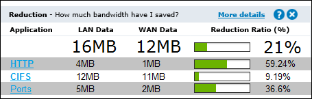
EXAMPLE
A ratio of 40% means a transfer that once put 100MB of load onto the WANWide Area Network, now puts 60MB of load on the WAN. I.e. 40% less.
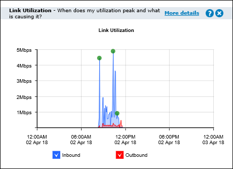
Link Utilization
The link utilization chart shows the throughput through the Exinda Appliance over time for inbound traffic and outbound traffic. It also shows the top three conversations at each of the utilization peaks. It answers questions such as, "Are you receiving the bandwidth that you are paying for? When is my throughput peaking? What could be causing bottlenecks on my network?"
Hover over the green dots on the throughput peaks to see the top conversations which may be the cause of the network bottlenecks. This level of visibility allows IT professionals to address root causes instead of mistakenly treating symptoms, e.g. buying more bandwidth to cope with peak load.
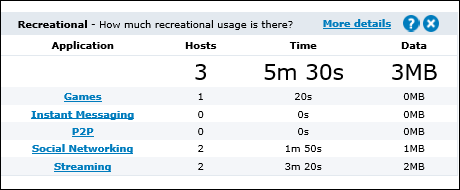
Recreational
Having visibility into key recreational applications is the first step to managing them. These applications are generally undesirable because they can impact the performance of key business applications, negatively impact customer experiences, reduce productivity, introduce viruses to the network and enable downloading of illegal or copyrighted material.
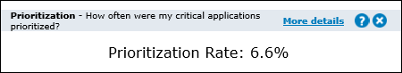
Prioritization
This ratio tells you how often critical applications were prioritized (also referred to re-ordering or re-queuing). A high percentage means that the system is prioritizing more often to ensure performance of your applications. A high percentage also means that by turning off optimization there is a higher probability that your critical applications will suffer.
Prioritization Ratio = Number of Packets Re-ordered / Number of Total Packets
EXAMPLE
A ratio of 40% means 40% of the packets on your network were re-ordered. That means that non critical data was queued so that business critical data could jump the queue and be delivered in the order that the business requires.
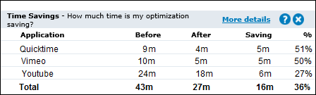
Time Savings
This table shows the improvement in transfer time due to WAN optimization. The Before time is the total amount of time an application would have taken to transfer data without WAN optimization. The After value is the actual amount of time taken with WAN optimization. The difference between the Before and After values is then shown as a time value and as a percentage.
Before = LANLocal area network Data / WAN Throughput
EXAMPLE
A Savings value of 50% means that the time taken to transfer an application's data was reduced by half.